Brands and organizations are moving more heavily into content marketing, and the demand to produce a stream of creative work means marketing managers are looking for ways to get it done at scale. One way to approach this is to develop a content package consisting of related pieces that can be used and re-purposed in a variety of ways, thereby extending the life of creative assets over the course of many months or a year.
Does your company participate in trade shows? Conduct surveys? Provide thought leadership? Run paid search and social campaigns? Have need for sales collateral? By looking at these needs holistically, you may be able to develop an approach and a content package that will provide assets for all of them, and at a steady cadence to fill out your content calendar.
How does this work?
Infographics are often the jumping-off point for a content package. Infographics typically incorporate 6-12 individual “data points”, often gleaned from a survey or set of features; each data point is displayed as an illustrated or graphic element paired with brief descriptive text. Infographics are well known for their eye-catching qualities and when printed, make great handouts at trade shows and conferences. They can be hard to digest on a smartphone screen, however. That’s one reason why it makes sense to turn your infographics into animated videos.
Get moving!
Animated videos have a reputation for being expensive, but many marketers don’t realize that half the labor involved is in the development of illustrations and copy. Your infographic has already done that work, so you may be halfway to the creation of an animated piece. Animated videos are easy to digest on phones, can be used to populate your site and social channels, and look great in your trade show booth – especially when there’s a matching piece of print collateral to take away.
Check out this piece for Axis Communications that we turned into a video.
Axis Communications – The Cybersecurity Storm from Matter on Vimeo.
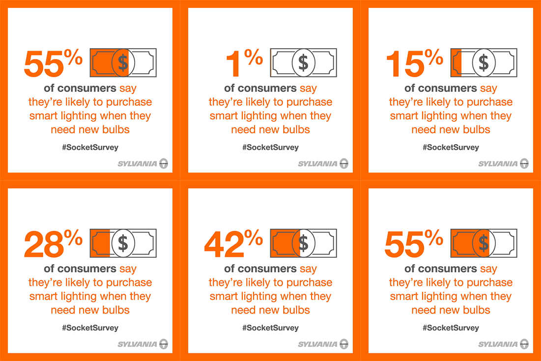
Another approach is to cut an infographic into pieces. Each data point can be made into a small stand alone infostamp image, or animated into a GIF. Presto! Now you’ve got 6-12 pieces for your content calendar. Use them to highlight individual points that you flesh out in a post, point viewers back to the “master” infographic or animated piece, drop them into an email template, or use them in a paid search or social campaign.
Check out this example of an infographic for Sylvania that spawned a number of small GIFs for use in social.


How far can it go?
Take a real-world example. One client came to us seeking marketing support for a new product launch at a trade show. We began by creating an infographic that mixes survey results and product details, basically framing a market problem and our client’s solution. The infographic will:
- Work as creative material for trade press
- Act as a printed handout at the event
- Become an animated video for display on monitors around the booth, which will draw the attention of passers-by (and will later be repurposed as a lead-gen tool featured on their website’s new product page)
- Transform into a set of 12 infostamps and GIFs, which will be used in paid and social outreach campaigns leading up to and after the show
- Support sales teams
Whew! That initial piece of infographic design turned into 14+ individual assets for use in a number of ways, and it was much less expensive than if each of those components had been considered separately. It’s all a part of building up a solid content library…but that’s a post for another day.
